 info@bestsoftcompany.com
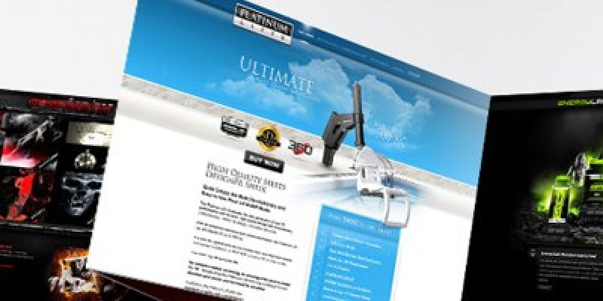
Responsive web design here means the same URLs work on a phone, tablet, and desktop without a separate m. site. Best Soft tests on the mobile networks and screen sizes we actually see from Georgia traffic — not only a browser resize on a designer laptop.
What we test
- Tap targets on contact, WhatsApp, and forms
- Menus that open without covering the number
- Images that do not blow the first load
- Forms that do not hide behind the keyboard
- Language switcher as real links, not a JavaScript-only widget
- Checkout or quote forms if the project includes them
Not a different product from web design
Every Best Soft marketing site is expected to be responsive. This page exists for buyers who searched specifically for responsive work: you get a QA pass on devices, not a second copy of the Web Design essay.
Performance on mobile
Hero videos and huge sliders are the usual LCP offenders. We keep the first screen light, lazy-load below the fold, and do not lazy-load the LCP image. Fonts are limited to the weights the layout uses.
Handover
Editors see the same panel on a phone. If a block is not safe to edit on mobile, we document it instead of leaving a trap.